


Table of contents
- 3 events that occur while tapping on the Hamburger icon
- Hiding regular navigation for mobile
- Designing Navigation Header
- Designing the navigation core component
- Overall code for the design
- Bring the navigation to the top
- Change Hamburger button to Cancel button
- Make a dark backdrop
- Complete javascript required
- CSS styles to tie it all together
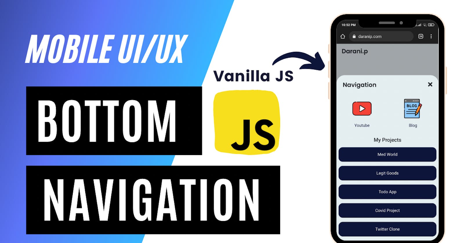
Top navigation with a hamburger menu is classic. But it's kinda boring, isn't it? As the smartphone displays are getting bigger and bigger, the UX of the top nav is getting worse. That's exactly where bottom navigation comes in.
When I started to design my site, I wanted my site to be user-friendly. Provided that the design of the site is the last thing we care about as a backed-first developer, I wanted to strike the balance with a strikingly beautiful UI.
Let's get started with how you can work your way towards building awesome navigation for your site.
Check out the expected result at my website (www.daranip.com)

3 events that occur while tapping on the Hamburger icon
- Bring the navigation content to the top.
- Change the hamburger icon to the cancel icon.
- Make a dark backdrop to separate the site from the navigation
Moreover, this navigation should not appear for desktops and should appear only for mobile interfaces, which means we need to use appropriate breakpoints to handle it.
Let's solve these issues one by one.
Hiding regular navigation for mobile
Because we are designing a new navigation while we do not disturb the existing navigation for desktops, we need to hide the navigation from mobile interfaces.
We will be using bootstrap for some part of this tutorial, so include the CDN links to your HTML file.
<!-- CSS only -->
<link href="https://cdn.jsdelivr.net/npm/bootstrap@5.2.0/dist/css/bootstrap.min.css" rel="stylesheet" integrity="sha384-gH2yIJqKdNHPEq0n4Mqa/HGKIhSkIHeL5AyhkYV8i59U5AR6csBvApHHNl/vI1Bx" crossorigin="anonymous">

<!-- JavaScript Bundle with Popper -->
<script src="https://cdn.jsdelivr.net/npm/bootstrap@5.2.0/dist/js/bootstrap.bundle.min.js" integrity="sha384-A3rJD856KowSb7dwlZdYEkO39Gagi7vIsF0jrRAoQmDKKtQBHUuLZ9AsSv4jD4Xa" crossorigin="anonymous"></script>
Now that you have included bootstrap on your site, you get superpowers.
Just include the class d-none d-lg-block to your existing navigation and you won't see them on your mobile interface.
Designing Navigation Header
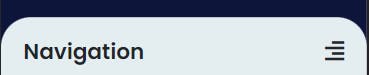
While Closed
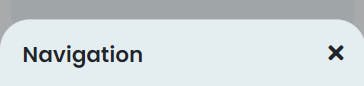
While Opened
To design this, we need to use flexbox, which might require its own post to explain. But for now, you can check this documentation to see its potential.
We will be using class="d-flex justify-content-between" for the div and then add the content within the <div> , so that the contents are moved to the edges of the display which is our required interface.

Example of
justify-content-between
Other classes are added to the personal design requirement.
<!-- Mobile Nav -->
    <section id="mobileNav" class="fixed-bottom hide-mnav">
        <div class="d-block d-sm-none d-md-none bg-lightblue mnav-bg">
            <div class="d-flex justify-content-between my-2">
                <h3 class="px-4 mt-4">Navigation</h3>
                <div id="mNav-open" class="px-4 mt-4" onclick="showMnav()">
                    <i class="fas fa-align-right" style="font-size: 1.5rem;"></i>
                </div>
                <div id="mNav-close" class="px-4 mt-4 unshowButton" onclick="closeMnav()">
                    <i class="fas fa-times" style="font-size: 1.5rem;"></i>
                </div>
            </div>
        </div>
    </section>
onclick() and showMnav() are methods that will be used to close and open the navigation using javascript.
If you had noticed the class
bg-lightblueand wondering what's that, I have customized bootstrap to my personal liking and have added support to custom colours in bootstrap. Customization can go very complex if that's something you want to do.Consider Subscribing to my newsletter or following me on Twitter to make sure you don't miss out on that tutorial.
You can use the classes bg-primary and bg-secondary instead of bg-lightblue and bg-darkblue for now.
Designing the navigation core component
<!-- list of links -->
<div class="mx-2 pb-3">
     <!-- list of elements -->
<div>
We have added a div to enclose the list of links. mx-2 pb-3 adds the required padding and margin.
<!-- single element -->
<a href="https://todo.daranip.com/" target="_blank">
    <div class="w-100 bg-darkblue mt-3 p-3 text-verylight text-center social-dm-tile">
        Todo App
    </div>
</a>
Duplicate this snippet to add as many links as you want.
Overall code for the design
<!-- Mobile Nav -->
     <section id="mobileNav" class="fixed-bottom hide-mnav">
         <div class="d-block d-sm-none d-md-none bg-lightblue mnav-bg">
             <div class="d-flex justify-content-between my-2">
                 <h3 class="px-4 mt-4">Navigation</h3>
                 <div id="mNav-open" class="px-4 mt-4" onclick="showMnav()">
                     <i class="fas fa-align-right" style="font-size: 1.5rem;"></i>
                 </div>
                 <div id="mNav-close" class="px-4 mt-4 unshowButton" onclick="closeMnav()">
                     <i class="fas fa-times" style="font-size: 1.5rem;"></i>
                 </div>
             </div>

             <div class="mx-2 pb-3">
                 <h5 class="text-center my-3">My Projects</h5>
                 <a href="https://medworld.daranip.com/" target="_blank">
                     <div class="w-100 bg-darkblue mt-3 p-3 text-verylight text-center social-dm-tile">
                         Med World
                     </div>
                 </a>
                 <a href="http://legitgoods.herokuapp.com/" target="_blank">
                     <div class="w-100 bg-darkblue mt-3 p-3 text-verylight text-center social-dm-tile">
                         Legit Goods
                     </div>
                 </a>
                 <a href="https://todo.daranip.com/" target="_blank">
                     <div class="w-100 bg-darkblue mt-3 p-3 text-verylight text-center social-dm-tile">
                         Todo App
                     </div>
                 </a>
                 <a href="https://covid.daranip.com/" target="_blank">
                     <div class="w-100 bg-darkblue mt-3 p-3 text-verylight text-center social-dm-tile">
                         Covid Project
                     </div>
                 </a>
                 <a href="https://twitter.daranip.com/" target="_blank">
                     <div class="w-100 bg-darkblue mt-3 p-3 text-verylight text-center social-dm-tile">
                         Twitter Clone
                     </div>
                 </a>
             </div>
         </div>
     </section>
Bring the navigation to the top
var showMnav = () => {
    var MNav = document.getElementById('mobileNav');
    MNav.classList.remove('hide-mnav');
}

var closeMnav = () => {
    var MNav = document.getElementById('mobileNav');
    MNav.classList.add('hide-mnav');
}
Change Hamburger button to Cancel button
var showMnav = () => {
    var mNavOpen = document.getElementById('mNav-open');
    var mNavClose = document.getElementById('mNav-close');
    mNavClose.classList.remove('unshowButton');
    mNavOpen.classList.add('unshowButton');
}

var closeMnav = () => {
    var mNavOpen = document.getElementById('mNav-open');
    var mNavClose = document.getElementById('mNav-close');
    mNavClose.classList.add('unshowButton');
    mNavOpen.classList.remove('unshowButton');
}
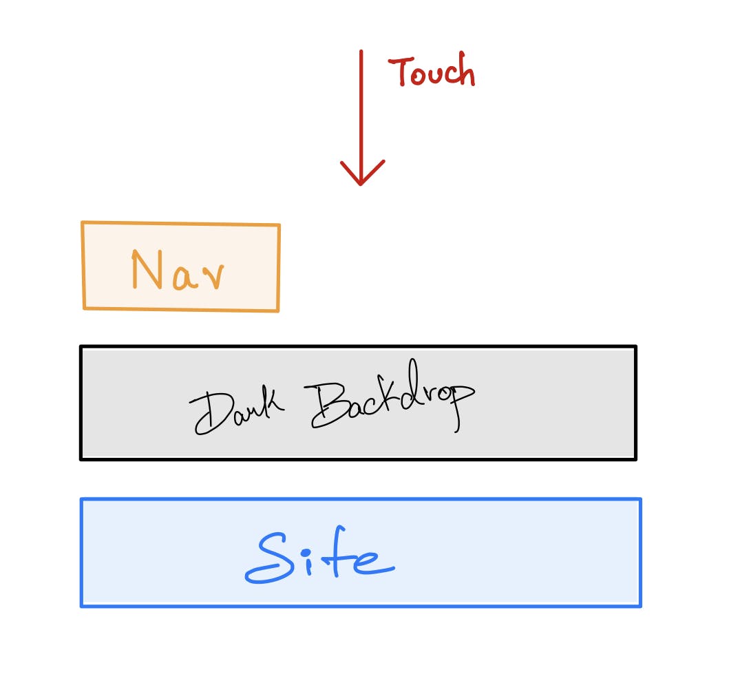
Make a dark backdrop
For the dark backdrop, we need to add a div that spans across the entire screen between the actual site and the navigation.
<section id="out-of-focus" class="">
</section>
Initially we don’t set the span css for the <div> as it creates a permanent layer that will be set above the actual website. This makes the website unusable because the user can’t touch the site but instead the <div> we use for the dark backdrop.
 #out-of-focus {
   z-index: 10;
   position: fixed;
   transition: 0.5s;
 }

 .focus-off {
   width: 100%;
   height: 100%;
   top: 0;
   left: 0;
   opacity: 0.3;
   background: #000;
 }
Now, we add the class .focus-off to bring the dark backdrop to action using javascript.
var showMnav = () => {
    let outoffocus = document.getElementById('out-of-focus');
    outoffocus.classList.add('focus-off')
}

var closeMnav = () => {
    let outoffocus = document.getElementById('out-of-focus');
    outoffocus.classList.remove('focus-off')
}
Complete javascript required
var showMnav = () => {
    var MNav = document.getElementById('mobileNav');
    MNav.classList.remove('hide-mnav');
    var mNavOpen = document.getElementById('mNav-open');
    var mNavClose = document.getElementById('mNav-close');
    mNavClose.classList.remove('removeButton');
    mNavOpen.classList.add('removeButton');
    var outoffocus = document.getElementById('out-of-focus');
    outoffocus.classList.add('focus-off')
}

var closeMnav = () => {
    console.log("Close");
    var MNav = document.getElementById('mobileNav');
    MNav.classList.add('hide-mnav');
    var mNavOpen = document.getElementById('mNav-open');
    var mNavClose = document.getElementById('mNav-close');
    mNavClose.classList.add('unshowButton');
    mNavOpen.classList.remove('unshowButton');
    var outoffocus = document.getElementById('out-of-focus');
    outoffocus.classList.remove('focus-off')
}
CSS styles to tie it all together
 #mobileNav {
   transition: 0.5s;
 }

 .mnav-bg {
   border-top-left-radius: 2rem;
   border-top-right-radius: 2rem;
 }

 .hide-mnav {
   transform: translateY(88%);
 }

 .unshowButton {
   display: none;
 }

 #out-of-focus {
   z-index: 10;
   position: fixed;
   transition: 0.5s;
 }

 .focus-off {
   width: 100%;
   height: 100%;
   top: 0;
   left: 0;
   opacity: 0.3;
   background: #000;
 }
Hope you have found this tutorial useful. Try to integrate the bottom navigation in your website and share your result on twitter by tagging me at @darani_p
I would be more than n happy to check what you have built. Have a nice day 🤩.